We live in a complex financial world. How to make sense of it? I have adopted the practice of studying indicators to help me quantify important financial relationships and to ask better questions. The best long-term investment results always come from the best raw material: a diversified portfolio of undervalued assets. I seek to find such assets by scouring the markets globally for opportunities. The common denominator of such assets is often that attractively priced opportunities come along with an obviously negative story: a crashing down cycle or some other clearly defined headwind. The best investments are invariably when well-established and thoroughly-discounted headwinds turn unexpectedly into tailwinds. For such rare yet profitable investments, both fundamentals and valuation improve leading to very attractive returns. Unexpected change is one of the key secret ingredients to successful investments.
The world has been filled with unexpected change for the last year or so. Often these changes express themselves across multiple asset classes. For instance, in May of 2014 (Making Volatility our Friend: Trading the Kitchin Cycle”, 5/28/14) I began to outline that I anticipated an inventory destocking cycle whose “unexpected” deceleration should pressure commodities, and likely credit as well, setting up an attractive buying opportunity in both. I wrote “Is Credit Quality Peaking?” in August of last year and suggested that the weakest quality bonds could suffer the most in such a down-cycle. As part of this series of examining the weak links in the global credit market, I wrote “Big Problems Start Small” in May of 2014 to highlight the growing turbulence in the Greek bond market, which a full year later turned into a story that still dominates the headlines.
As the market began to price in my fears from a year ago, many asset prices fell to levels that suggested strong upside with limited downside – that magical combination that all value investors seek! My thinking in March was as follows: with the worst of the inventory cycle destocking pressures in the rear view mirror, many new investments, such as those in the deeply depressed world of commodities, held great promise. After all 1.) asset prices were finally cheap enough after their long and bruising multi-year decline – with some prices down 90% or more and 2.) headwinds I had identified early should have been turning into tailwinds as the inventory cycle reversed out of the trough. Many commodities and related investments did bounce very aggressively off of deeply depressed levels. All was right with the world. Or so it seemed.
And then something happened that I did not expect: some prices resumed falling. Why? Credit – perhaps still tainted by Greece or perhaps the much larger specter of China – refused to strengthen and instead weakened again. Is the spread of credit weakness even more important and pervasive than even I had thought? I explore this question in this week’s “Trends and Tail Risks.”
The Simplest Answers are Most Often the Best
I am always on the lookout for the broadest possible narrative with which I can explain many of the seemingly disparate moves I see across many different asset classes. It has been my experience that often there are dominant themes driving the narrative for even the biggest and broadest of moves. What defined the stock market boom of the late 1990s? The Internet Bubble. The emerging markets bull market of the 2000s? The Industrialization of China. The harrowing credit-driven crash of 2007-2009? The U.S. Subprime Mortgage Bubble. See! This is easy – in retrospect! What about in prospect?
Of course – as Kierkegaard warns us – life must be lived forwards. In real-time it can be a huge challenge to understand the dominant theme. The dominant theme is often so big that we are all unaware that we are immersed in it. One of my long-held hypotheses is that how the world chooses to deal with its overindebtedness is a dominant theme. Europe chose to ignore the success of the U.S. Federal Reserve’s “Quantitative Easing” (QE) policy until the beginning of 2015. Europe chose to suffer from no growth and rising credit stress that has threatened to tear the whole European project apart with recurrent problems in Greece and other highly indebted countries. Hopefully Europe has put this mistake behind it.
The U.S. Federal Reserve, on the other hand, chose QE and growth. What a difference it made not just to asset prices but to metrics like unemployment and manufacturing! Many emerging markets chose to ignore their problems and gorged on “cheap” U.S. dollar-denominated funding. This is a choice that they now regret. As their currencies fall, this borrowing is proving to be very expensive to repay.
China now is in the throes of choosing how to deal with its own credit crisis and very recently, strong equity market sell-off. What choice will China make? Will it be successful? One of my good friends, a very savvy investor with a great track record, told me recently that everyone who has under-estimated the power of a motivated central banker since 2008 has made a mistake. With so much at stake now, what are the indicators to monitor? I walk through some of my favorites below.
Credit Stress Seems to be Spreading
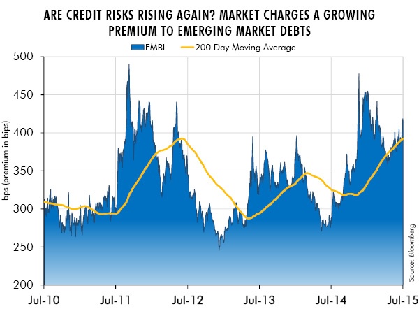
The chart below shows that the market is charging a growing premium to emerging market countries to borrow. A rising line is a bad thing because it represents a rising premium in basis points (100 basis points = 1%) to borrow for emerging markets over prevailing interest rates in the U.S.
Credit quality in emerging markets deteriorated rapidly once the inventory cycle peaked in the late summer of 2014 ("Credit: Caught Leaning?", 8/13/14). That much I expected to see. But what about this recent backup? Is this just noise – or is this the start of a new and sustained deterioration in emerging market credit quality? Certainly a rising dollar would put even more pressure on these emerging market debtors. As their currencies weaken, inflation rises and central banks often get forced into counter-cyclical rate hikes to stabilize falling currency values. It can be a nasty combination. For such countries, a weakening dollar could buy them some time to breathe life into their slowing economies.
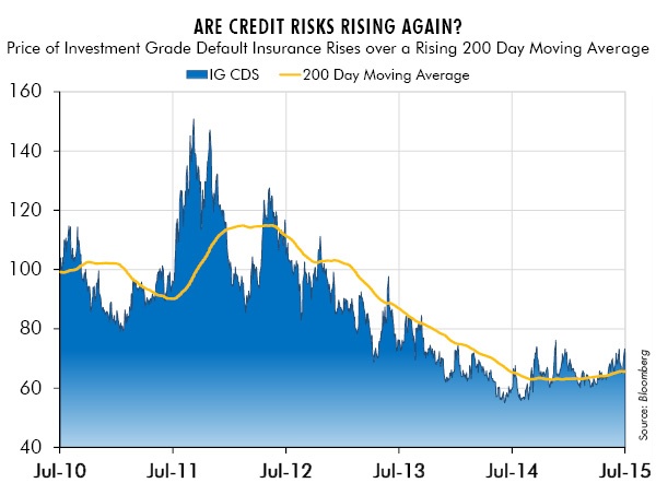
The chart below illustrates the weakness in credit over the last few weeks through the rising price of credit insurance. In particular, the chart shows the cost to purchase default insurance (credit default swaps) on investment grade debts in the U.S. Despite the fact that the pressures from the destocking cycle have faded, credit quality continues to weaken, even among highly rated borrowers. This seems counterintuitive to me. Is this temporary or is this another sign that credit’s problems are more deeply rooted than I anticipated?
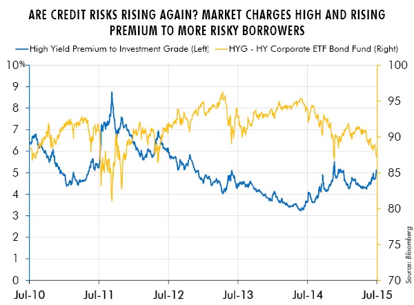
Worries about credit extend into the more volatile U.S. high yield market as well. The chart below shows that the price of the junk bond exchange-traded-fund, HYG (right hand scale), falls as the market demands a rising yield premium to lend to weaker borrowers (left hand scale in %).
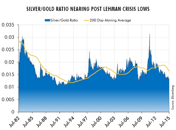
Another key ratio agrees with rising credit risks: the ratio of the price of silver/gold. The silver/gold ratio is one of the most sensitive of all the leading indicators I have discovered. The message of a falling ratio tends to be one of falling growth and/or falling inflation expectations. Clearly since 2011 this ratio has crashed dramatically. Outside of the U.S. this has meant worsening credit quality and falling commodity prices, particularly in emerging markets. From 2011-2014 the U.S. credit markets largely ignored this sensitive warning sign. The same could not be said for markets outside the U.S. Their credit markets have been in stages of distress for a number of years now. Is the greater credit stress of the last few weeks a sign that the U.S. is finally joining them? If so, then expectations for continued higher long-term interest rates may prove to be too aggressive. However, if the U.S. markets continue to be immune from rising global credit stress much more damage might be done in emerging markets before the Fed realizes its error.
The silver/gold ratio would likely anticipate such a forward looking change in Fed policy. Its pace of decline has slowed yet it remains at deeply oversold levels. Or perhaps is the most important message that the silver/gold ratio is nearing levels of stress not seen since the collapse of Lehman? The silver to gold ratio remains deeply deflationary even though credit quality in the U.S. remains far from distressed levels. Can this strange dichotomy continue?
In Conclusion
Thankfully, in an ever-changing and often confusing investment world, there are a few things on which I can always count. First, that valuation always matters. A cheap entry price is always great raw material for future returns. Second, that patience is required! Cheap stocks, after all, can get cheaper. Third, that timing is hard. I diligently seek out unexpected change. But as long as clairvoyance eludes me, thoughtful portfolio construction is always a constant friend and ally. These truths form the foundation of investment analysis and portfolio construction. Add to such a thoughtful investment program – the illusive clarity of the dominant theme – and the results can be truly impressive. Make no mistake: this is extremely hard to do. Nonetheless it remains my goal! Indicators, such as those outlined above, can be a useful tool to help get closer to the theme that unifies trends across asset classes. Perhaps all these tools working together can overcome the curse of Kierkegaard so that we may understand life forward. •


